


6
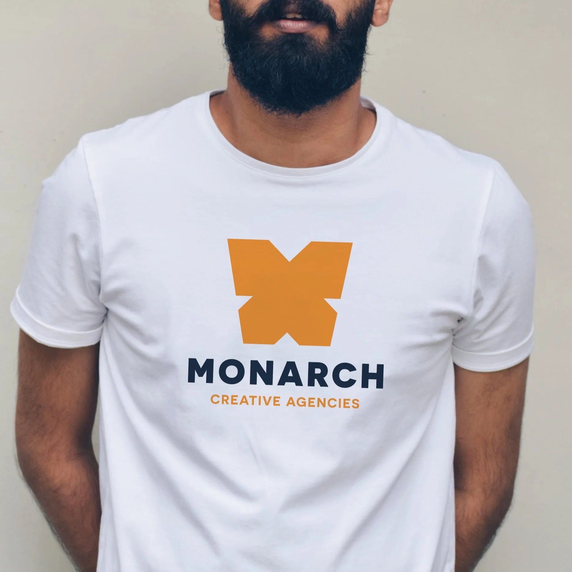
MONARCH
8
OPTIMUM RETAILING
5
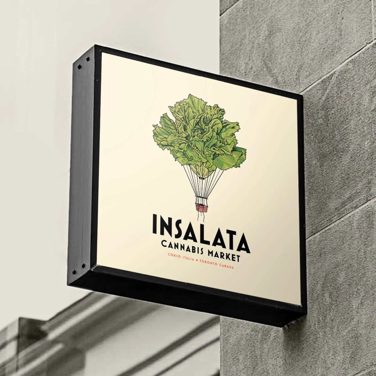
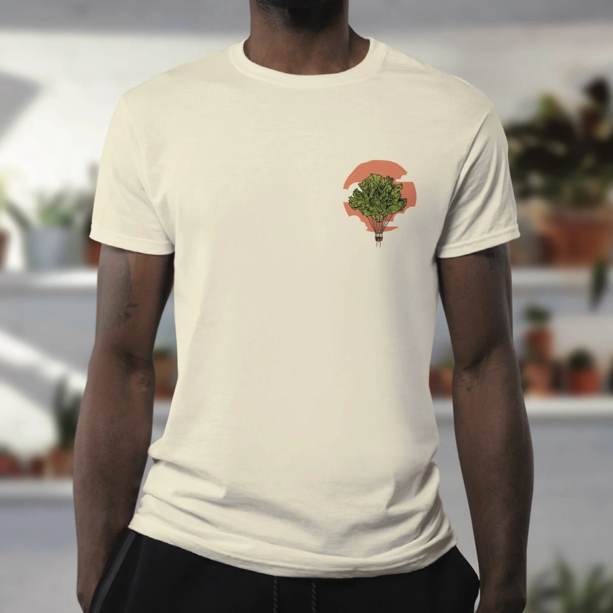
INSALATA

1
CRISPERS

2
PEEK FREANS

2
GROW WILD

6
RITUAL YOGAHOUSE
9
MORE PROCESS
6
Algonquin Catering

2
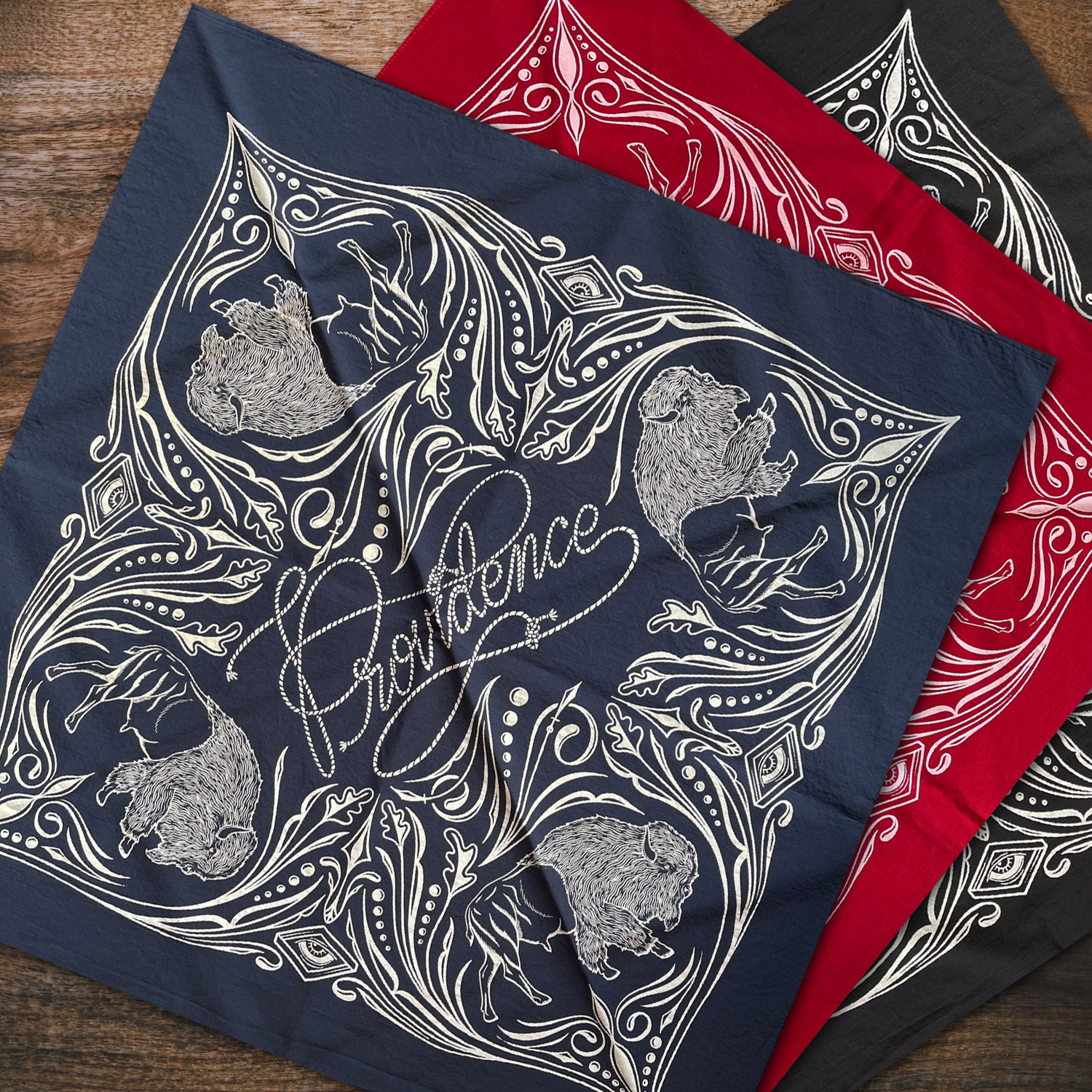
PROVIDENCE Lucky Coin

2
AgMEDICA BIOSCIENCE

3
Niko's

5
MORE ILLUSTRATION

5
WELLWORTH

5
More Lettering & Fonts

3
Providence PTBO
1
FREE TO ROAM - PROV

1
BAUHAUS CHRISTMAS

3
LAKERS x PTBO Northern Originals

2
ANS

1
B17 Psychedelic Buzz
3
KAWARTHA BELT SERVICES

2
Mothers of Literacy

1
JORDAN ANASTASI

2
ELECTRIC TIGER

0
ABOUT